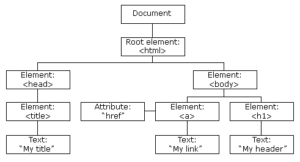
Document Object Model
The Document Object Model (DOM) is a programming interface for HTML and XML documents. It represents the page so that programs can change the document structure, style, and content. The DOM represents the document as nodes and objects. That way, programming languages can connect to the page.
A Web page is a document. This document can be either displayed in the browser window or as the HTML source. But it is the same document in both cases. The Document Object Model (DOM) represents that same document so it can be manipulated. The DOM is an object-oriented representation of the web page, which can be modified with a scripting language such as JavaScript.
A large DOM will increase memory usage, cause longer style calculations, and produce costly layout reflows
- Total DOM Elements
- Maximum DOM Depth
- Maximum Child Elements
Lighthouse flags pages with DOM trees that:
- Have more than 1,500 nodes total.
- Have a depth greater than 32 nodes.
- Have a parent node with more than 60 child nodes.
DOM vs BOM
- The DOM is the Document Object Model, which deals with the document, the HTML elements themselves, e.g. document and all traversal you would do in it, events, etc.
- The BOM is the Browser Object Model, which deals with browser components aside from the document, like history, location, navigator and screen (as well as some others that vary by browser).
Outline
- What is DOM
- Tree/Structure
- W3C? Where the DOM came from
- Node?
- Levels Of DOM
- Uses an Expensive DOM size
- Recommendations
- Virtual DOM?
What is DOM?
- When a web page is loaded, the browser creates a Document Object Model of the page.
- The DOM is a W3C (World Wide Web Consortium) standard.
- The W3C DOM standard is separated into 3 different parts:
- DOM a programming interface specification being developed by the W3C (World Wide Web Consortium)
- DOM is a browser’s internal programmatic representation of the webpage
- Can be manipulate by language like javascript
- Set of heirarchical collection of Objects/Elements
Tree?
W3C? and Where the DOM came from?
- w3c is a vendor organization. main vendors are microsoft and Netscape
- DOM is recommended by W3C.
- Browser wars in 1990 between Netscape Navigator and Microdoft Internet Explorer
- 1996 within Netscape Navigator 2.0 “DOM Level 0″ or “Legacy DOM”
- W3C in late 1998 – > 2000 introduce.. DOM Level 1 and 2.
- 2005, large parts of W3C DOM were well-supported by common ECMAScript-enabled browsers
- Different as per the browser
What is a Node?
- The DOM presents documents as a hierarchy of Node objects that also implement other, more specialised interfaces.
- Element Node – contains an HTML tag
- Text Node – contains text
- Text Nodes are contained in Element Nodes
- Comment nodes and so on
Level Of DOM
- Level 0: Provides low-level set of interfaces.
- Level 1: DOM level 1 can be described in two parts: CORE and HTML.
- Level 2 : consists of six specifications: CORE2, VIEWS, EVENTS, STYLE, TRAVERSAL and RANGE.
- Level 3: consists of five different specifications: CORE3, LOAD and SAVE, VALIDATION, EVENTS, and XPATH.
Note: www-dom@w3.org will remain open. This list is for general discussion about the existing W3C Recommendations.
Uses An Excessive DOM Size
- A large DOM tree can harm your page performance in multiple ways.
- Network efficiency and load performance. If you server ships a large DOM tree, you may be shipping lots of unnecessary bytes. This can also slow down page load time, because the browser may be parsing lots of nodes that aren’t even displayed above-the-fold.
- Runtime performance. As users and scripts interact with your page, the browser must constantly re-compute the position and styling of nodes. A large DOM tree in combination with complicated style rules can severely slow down rendering.
- Memory performance. If you use general query selectors such as
document.querySelectorAll(‘li’) you may be unknowingly storing references to a very large number of nodes, which can overwhelm the memory capabilities of your users’ devices.
Recommendations
- Has less than 1500 nodes total.
- Has a maximum depth of 32 nodes.
- Has no parent node with more than 60 child nodes.
- In general, look for ways to create DOM nodes only when needed, and destroy them when no longer needed.
- If your server ships a large DOM tree, try loading your page and manually noting which nodes are displayed. Perhaps you can remove the undisplayed nodes from the loaded
document, and only create them after a user gesture, such as a scroll or a button click. - If you can’t avoid a large DOM tree, another approach for improving rendering performance is simplifying your CSS selectors. See Reduce The Scope And Complexity Of Style Calculations.
Example
        Use this :-
	<ul id="navigation-main">
    		etc..
	</ul>

instead of this :-

	<div id="navigation-main">
    		<ul>
        			etc..
    		</ul>
	</div>
Another Normal ways
- Split large pages into multiple pages
- Lazy load and Paginate everything possible
- Don’t hide unwanted elements using CSS
- Use less bloated builders like Oxygen
- Use xml wisely
- Use the google analytics wisely
Virtual DOM?
- At any point in time, the React library maintains two copies of the Virtual DOM
- Pristine Version and Dirty Version
- later on it will perform a diff operation between the pristine version and the dirty version and a delta is computed. Later on, this delta will be applied to the real DOM so that only the required part of the web page is updated, instead of repainting the entire web page.
CSS
Put CSS in the document head
- Cascading Style Sheet (CSS) is the element that is read first by the web browser when loading a page. The browser will not render the page until all stylesheets have been downloaded and parsed.
- It is important to put the inline style blocks and references to external stylesheets in the head of the page. If they are in the body of a page they can significantly reduce the loading speed and even cause reflows that will further hit the performance of your website.
Optimize the order of styles
- Style tags and calls to stylesheets should be placed before your scripts. If you do this your pages load faster.
- The solution is to simply make sure that your styles (css) come higher on the page than your scripts do. Google has determined this by testing several different scenarios and combinations of styles and scripts, however there is one main reason that this is faster.
For Example:
<head>
<title>title</title>
<style> css code goes here</style>
<script> javascript code goes here </script>
</head>
Make CSS external
- Using external files in the real world generally produces faster pages because the CSS files are cached by the browser.
- CSS that are inlined in HTML documents get downloaded every time the HTML document is requested. This reduces the number of HTTP requests that are needed, but increases the size of the HTML document.
- On the other hand, if the CSS are in external files cached by the browser, the size of the HTML document is reduced without increasing the number of HTTP requests.
Avoid CSS @import
CSS @import allows stylesheets to import other stylesheets. When CSS @import is used from an external stylesheet, the browser is unable to download the stylesheets in parallel, which adds additional round-trip times to the overall page load
Avoid CSS expressions
We should Avoid CSS Expressions, because CSS expressions are only supported by Internet Explorer 5 to 7.
background-color: expression( (new Date()).getHours()%2 ? “#B8D4FF” : “#F08A00” );
The example above set the background color to either of two hex values, depending on the current time. The problem here is that the browser executes the code over and over again, each time the user interacts with the page (scroll, click, and even move the mouse). Even though this only affects the performance inside each individual browser, it can result in a slow-performing browser.
Inline small CSS
If the external CSS resources are small, you can insert those directly into the HTML document, which is called inlining.
Ensure text remains visible during webfont load
The easiest way to avoid showing invisible text while custom fonts load is to temporarily show a system font. By including font-display: swap in your @font-face style:
@font-face { font-family: ‘Pacifico’; font-style: normal; font-weight: 400;
src: local(‘Pacifico Regular’), local(‘Pacifico-Regular’), url(https://fonts.gstatic.com/…
font-display: swap;
}
If you are using google Fonts, add the &display=swap parameter to the end of your Google Fonts URL:
<link href=”https://fonts.googleapis.com/css?family=Roboto:400,700&display=swap” rel=”stylesheet”>
JS (JavaScripts)
Reduce JavaScript execution time
- Avoid setTimeout or setInterval for visual updates
- Move long-running JavaScript off the main thread to Web Workers.
- Use micro-tasks to make DOM changes over several frames.
- setTimeout and Promise
- Promise are sent to queue, while setTimeout blocks the process
- Use Chrome DevTools’ Timeline and JavaScript Profiler to assess the impact of JavaScript.
Ref:
Defer parsing of JavaScript
- Defer Parsing of JavaScript can be defined as the process of using defer or async attribute with JavaScript to avoid render blocking of the first paint of the web page.
- So if you defer parsing of JavaScript that means JavaScript(s) should load, only after the meaningful content of the website has loaded.
- JavaScript is only parsed when needed, again by calling eval() on the string literal.
Example:
- <script defer src=”https://example.com/script.js“></script>
- <script async src=”https://example.com/script.js“></script>
Ref:
http://googlecode.blogspot.com/2009/09/gmail-for-mobile-html5-series-reducing.html
Minify JavaScript
- Remove Unused spaces that is written in your JavaScript,
- Remove Unnecessary line-breaks in your JavaScript
- Remove Unnecessary code written in your JavaScript
- Avoid large computation using Javascript, shift it to Server Side
- Using page speed htaccess configuration
Apache : ModPagespeedEnableFilters rewrite_javascript
Nginx : pagespeed EnableFilters rewrite_javascript;
Ref:
- view-source:https://datascience.foundation/
- https://github.com/mishoo/UglifyJS2
- https://developers.google.com/closure/compiler
- https://www.modpagespeed.com/doc/filter-js-minify
- https://easyengine.io/tutorials/nginx/using-pagespeed/
- https://www.modpagespeed.com/doc/download
Inline small JavaScript
- External blocking scripts force the browser to wait for the JavaScript to be fetched, which may add one or more network round-trips before the page can be rendered.
- If the external scripts are small, you can inline their contents directly into the HTML document and avoid the network request latency.
Ref:
https://developers.google.com/speed/docs/insights/BlockingJS#InlineJS
Make JavaScript external
- Using external files in the real world generally produces faster pages because the JavaScript and CSS files are cached by the browser.
- JavaScript and CSS that are inlined in HTML documents get downloaded every time the HTML document is requested. This reduces the number of HTTP requests that are needed, but increases the size of the HTML document.
- On the other hand, if the JavaScript and CSS are in external files cached by the browser, the size of the HTML document is reduced without increasing the number of HTTP requests.
Optimise the order of scripts
- Correctly ordering external stylesheets and external/inline javascript enables better parallelisation of downloads and speeds up browser rendering time.
- Because, JavaScript code can alter the content and layout of a web page, the browser delays rendering any content that follows a script tag until that script has been downloaded, parsed and executed.
- However, more importantly for round-trip times, many browsers block the downloading of resources referenced in the document after scripts until those scripts are downloaded and executed. On the other hand, if other files are already in the process of being downloaded when a JS file is referenced, the JS file is downloaded in parallel with them.
Remove duplicate JavaScript
- Duplicate JavaScript and CSS files hurt performance by creating unnecessary HTTP requests (IE only) and wasted JavaScript execution (IE and Firefox).
- In IE, if an external script is included twice and is not cacheable, it generates two HTTP requests during page loading. Even if the script is cacheable, extra HTTP requests occur when the user reloads the page.
- In both IE and Firefox, duplicate JavaScript scripts cause wasted time evaluating the same scripts more than once. This redundant script execution happens regardless of whether the script is cacheable.
Media
Server Images in Next-Gen formats
JPEG 2000, JPEG XR, and WebP are image formats that have superior compression and quality characteristics compared to their older JPEG and PNG counterparts. Encoding your images in these formats rather than JPEG or PNG means that they will load faster and consume less cellular data.
- JPEG 2000
- JPEG XR
- WebP
JPEG 2000
JPEG 2000 is a newer incarnation of the JPEG format. The primary purpose of the format is to preserve metadata through radical compression techniques. While most traditional JPEGs have a limited set of metadata for photographs, JPEG 2000 uses structured XML to include a vast array of metadata information. It is mainly supported on safari only.
JPEG XR
JPEG XR is yet another next-gen JPEG format. JPEG XRs application is less intense than JPEG 2000 and was designed in many ways to be the successor of the standard JPEG format. It is mainly supported in IE only.
WebP
WebP is the open source answer to the next generation of both JPGs and PNGs. The primary application of WebP is the web and is routinely 25% smaller than both optimized PNGs and JPGs. WebP has animation support too and can be a great replacement for GIFs as well.
Some Live examples of WebP
Properly size images
Ideally, your page should never serve images that are larger than the version that’s rendered on the user’s screen. Anything larger than that just results in wasted bytes and slows down page load time.
The main strategy for serving appropriately-sized images is called “responsive images”. With responsive images, you generate multiple versions of each image, and then specify which version to use in your HTML or CSS using media queries, viewport dimensions, and so on.
Serve Responsive images
<img src=”flower-large.jpg” srcset=”flower-small.jpg 480w, flower-large.jpg 1080w” sizes=”(max-width:1387px) 50vw, 1387px” />
Use video formats for animated content
Large GIFs are inefficient for delivering animated content. By converting large GIFs to videos, you can save big on users’ bandwidth. Consider using MPEG4/WebM videos for animations and PNG/WebP for static images instead of GIF to save network bytes.
As we all know the GIF has some limitations like it doesn’t support the sound, controles, and loop. So make sure about the video/animation quality and client’s requirement while using the GIF.
It also different when it comes to CPU load time
| FORMAT | CPU TIME |
| GIF | 2,668 ms |
| MPEG-4 | 1,994 ms |
| WebM | 2,330 ms |
Defer offscreen images
Offscreen images are images that appear below the fold. Since users can’t see offscreen images when they load a page, there’s no reason to download the offscreen images as part of the initial page load. In other words, deferring the load of offscreen images can speed up page load time and time to interactive.
Regarding off screen image, only download above-the-fold images during the initial request.
Applying this strategy to your JS, HTML, CSS, and other resources can also speed up page load time.
Eliminate Render-Blocking (resources) JavaScript and CSS?
What is Render-Blocking(resources) JavaScript and CSS?
Three types of render-blocking URLs: scripts, stylesheets, and HTML imports:
A <script> tag that:
- Is in the <head> of the document.
- Does not have a defer attribute.
- Does not have an async attribute.
A <link rel=”stylesheet”> tag that:
- Does not have a disabled attribute. When this attribute is present, the browser does not download the stylesheet.
- Does not have a media attribute that matches the user’s device.
A <link rel=”import”> tag that:
- Does not have an async attribute.
How to identify critical resources
- The first step to reducing the impact of render-blocking resources, is to identify what’s critical and what’s not.
- Use the Coverage tab(Ctrl + Shift + P) in Chrome DevTools to identify non-critical CSS and JS. When you load or run a page, the tab tells you how much code was used, versus how much was loaded:
You can reduce the size of your pages by only shipping the code and styles that you need. Click on a URL to inspect that file in the Sources panel. Styles in CSS files and code in JavaScript files are marked in two colors:
- Green (critical): Styles that are required for first paint; code that’s critical to the page’s core functionality.
- Red (non-critical): Styles that apply to content not immediately visible; code not being used in page’s core functionality.
How to eliminate render-blocking scripts
- Once you’ve identified critical code, move that code from the render-blocking URL to an inline script tag in your HTML page. When the page loads, it will have what it needs to handle the page’s core functionality.
- Code that isn’t being used at all should be removed
- If there’s code in a render-blocking URL that’s not critical, you can keep it in the URL, and then mark the URL with async or defer attributes (see also Adding Interactivity with JavaScript).
How to eliminate render-blocking stylesheets
- Similar to inlining code in a <script> tag, inline critical styles required for the first paint inside a <style> block at the head of the HTML page. Then load the rest of the styles asynchronously using the preload
- Consider automating the process of extracting and inlining “Above the Fold” CSS using the Critical tool.
- Another approach to eliminating render-blocking styles is to split up those styles into different files, organized by media query. Then add a media attribute to each stylesheet link. When loading a page, the browser only blocks the first paint to retrieve the stylesheets that match the user’s device.
- You’ll want to minify your CSS to remove any extra whitespace or characters (see Minify CSS). This ensures that you’re sending the smallest possible bundle to your users.
How to eliminate render-blocking imports
- For non-critical HTML imports, mark them with the async attribute. As a general rule, async should be used with HTML imports as much as possible.
Note: Keep in mind that you should not force your website to score a perfect 100. Just try your best to get a good score without sacrificing user experience.
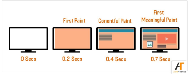
First Meaningful Content (FMP)
What Is FMP?
Ans: FMP identifies the time at which the user feels that the primary content of the page is visible.
How to speed it up ?
Ans: Optimizing the Critical Rendering Path is helpful for achieving a faster First Meaningful Paint.
Optimizing The Critical Rendering Path
- Optimizing for performance is all about understanding that how HTML, CSS, and JavaScript bytes are processed & renders the pixels on the screen.
FP, FCP and FMP
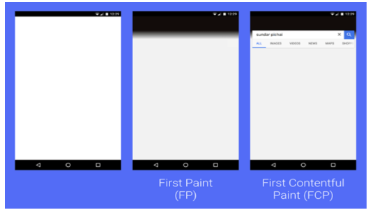
First Contentful Paint (FCP)
What Is First Contentful Paint (FCP) ?
- First paint (FP) refers to the point at which the first pixel renders on a screen after a user navigates to a web page. (e.g. Background colour)
- First Contentful Paint (FCP) measures the time from navigation to the time when the browser renders the first bit of content from the DOM.
- It contains a reporting the time when the browser first rendered any text, image, non-white canvas or SVG. This is the first time users could start consuming page content.
- This timing aims to be more representative of whether a user perceives a site as “fast” or “slow”.
Difference Between FP & FCP
How to Speed It Up?
- Minimize the number of render-blocking external stylesheets and scripts.
- Render-Blocking CSS
- Third-Party JavaScript
- Use HTTP caching
- Minimize the download size by optimizing & compressing the resources.
- Minify and compress text-based assets to speed up their download time
Render Blocking Css
- By default, CSS is treated as a render blocking resource. So the browser won’t render any processed content until the CSSOM (CSS Object Module) is constructed.
- Use CSS “media types” and “media queries” to mark some css resources as non-render blocking.
<link href=”default.css” rel=”stylesheet”>
<link href=”print.css” rel=”stylesheet” media=”print”>
<link href=”other.css” rel=”stylesheet” media=”(min-width: 40em)”>
<link href=”portrait.css” rel=”stylesheet” media=”orientation:portrait”>
Third-party Javascript
- Minimize Or Remove ads, analytics, trackers, social-media buttons, and so on.
- Load the script using the async & defer attribute.
- Consider self-hosting the script if the third-party server is slow.
- Consider removing the script if it doesn’t add clear value to our site
- Use resource hints to reduce connection setup time
- Perform a DNS lookup for domains hosting third-party scripts
<link rel=”dns-prefetch” href=”http://example.com”>
<link rel=”preconnect” href=”http://example.com”>
<link rel=”preload” href=”image.png”>
Use HTTP Caching
- Large responses require many round trips between the client and server, which only delays when they are available on client side & browser can process them.
- Nowadays, every browser has the ability to cache and reuse previously fetched resources. To perform caching we must ensure that each server response provides the correct HTTP header directives.
- Each resource can define its caching policy via the Cache-Control HTTP header. These directives control who can cache the response, under which conditions, and for how long.
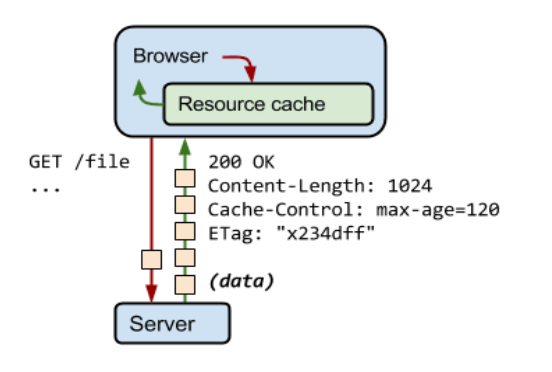
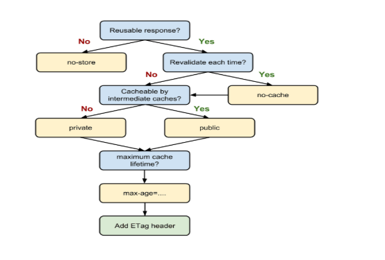
Types of Cache-Control Directives
- no-cache & no-store
- Public vs. private
- Max-age
Other Steps
- Minify & Compress text-based assets that the browser has to download.
- Use code-splitting to break up your JavaScript into what is critical and what is not. Ref : https://webpack.js.org/
- Lazily loading in code that is non-critical.
- Removing unused code. Ref : https://developers.google.com/web/updates/2017/04/devtools-release-notes#coverage
- Use long-term caching to avoid having to re-fetch resources that haven’t changed